International comparisons
Looking at science spending internationally shows that the UK could certainly invest more in research without compromising our economic wellbeing.
Viewed globally, the UK government’s investment in science per capita seems unremarkable; we’re 18th in the world. Clearly, it’s possible for a government to invest a lot more in science than we do here in the UK.

The top public spender on science is Norway, which invests over twice as much as we do per capita, and we are significantly out-spent by governments from Germany to the US. In fact, looking at international averages, the UK public expenditure on R&D of £134 per person per year puts us below the average for the G8 (£187), the OECD (£160) and the twenty-seven countries of the EU (£142).
Another way to look at these figures is to consider research expenditure as a percentage of GDP. Once again, the UK comes in below the average for major groups of nations.
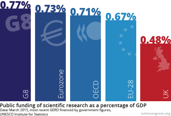
As these two graphics demonstrate, other countries devote much more money to research than the UK does. This suggests that spending more on science isn’t likely to stunt economic growth and, whilst correlation obviously doesn’t imply causation, it’s also possible that science and the side-effects of science spending may have played a part in their success.
There is a sense in which international comparisons aren’t very interesting, though: most countries have chosen their science budgets in a similar way to the UK, via a complex chronology of political compromise, rather than by taking a step back and performing a comparison of costs and benefits. Also, while focusing on how different countries measure up relative to one another, it’s easy to lose sight of how small these figures are in absolute terms: there are only four countries whose governments spend more than 1% of GDP on research.