Science and UK Spending Review 2013
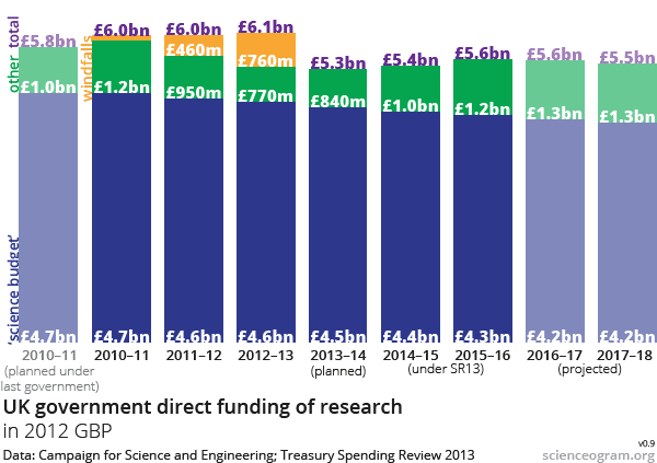
With the dust settling on yesterday’s Spending Review we were surprised to note that, in amongst a vast amount of comment and analysis on the topic, we’ve seen very few graphs. We therefore decided to update our Science Budget 2010–15 graph to show future expenditure on science under the newly-announced Treasury plans. It’s not a particularly pretty picture.

UPDATE: We have produced a revised version of this graph, based on government figures rather than figures inferred from announcements, here.
The most obvious trend on this graph is that the blue bars, representing the core science budget, are suffering relentless erosion through inflation. Restoring the green bars, representing capital and other science spending, to pre-cut levels is not enough to offset this. And intermittent windfalls, represented in yellow, will need to be significant over the next couple of years in order to make up the shortfall.
The reaction to this has been almost universally cool; enthusiasm for the restoration of capital spending is necessarily tempered by the falling core science budget, which will have suffered a significant 10% cut in real terms by 2015. Indeed, the extension of flat cash sets a dangerous precedent: even with the commitment to keeping science capital spending topped up in real terms, the overall budget will continue to decline towards the end of the decade after a minor uptick in the next couple of years.
It’s vitally important that the science community unites behind a common call that ‘flat cash is not enough’. Whether you look at our spending in an international context, or simply think that it’s not acceptable to spend 28p per person per year on stroke research when stroke is responsible for 10% of deaths, a stagnating science budget doesn’t really cut it.