Ice buckets, research and the cost of disease
The rush of support for the Ice Bucket Challenge led to the viral popularity of an infographic comparing the amount of money donated to charity campaigns raising money for certain diseases to the number of deaths they cause. We at Scienceogram have produced our own version of the graphic correcting some issues with the original. Please feel free to share it!

What we research vs what kills us
Many people’s social network pages are covered by exponentially-multiplying videos showing people pouring buckets of icy water over their heads in the name of charity. Specifically, everyone from your half-forgotten schoolfriends to a roll-call of celebrities and politicians have been dousing themselves and then donating in the name of ALS, a degenerative condition also known as motor neurone disease (MND).
This torrent of support has naturally led to commentators trying to pour cold water over the cause for everything from wasting water to charity administration costs. Perhaps the most serious complaint has been that ALS is already a well-funded condition which isn’t in need of this flood of extra donations.
The infamous Vox infographic
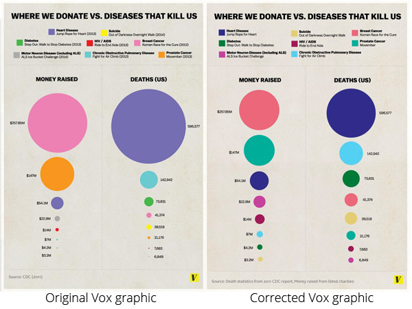
Leading the charge is a graphic from Vox, which compares the amount of money donated to charity campaigns raising money for certain diseases to the number of deaths they cause. This is a vitally important point, and one we’ve made before; the funding of research into diseases is often wildly out of step with their deadliness, the amount of suffering they cause and their economic impact.
However, the Vox graphic has some serious issues:
- It only considers single fundraising events for the diseases it lists. It’s unsurprising that a high-profile event like Movember raises a lot of cash, and it’s not representative of the wider fundraising work done by charities. It also completely neglects government-funded research.
- The circles’ diameters are proportional to the number shown instead of their area, which is what your eye picks up on. This is a very basic oversight, and significantly exaggerates the differences between small and large numbers. To their credit, Vox have engaged with their critics and corrected the latter point in the latest version of the graphic. You can see the comparison between the two versions below, and it’s obvious that using diameter rather than area totally changes how this visualisation looks:

- Looking solely at deaths ignores the other impacts of many diseases, such as effects on quality of life, or economic costs associated with them.
Whilst these errors exaggerate the disparity, the message of the graph is correct: some conditions are funded significantly less than would be proportional to their share of death and suffering.
A Scienceogram reimagining
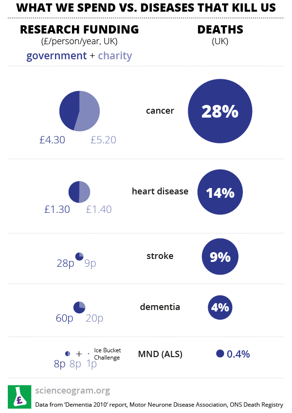
We’ve produced a graphic inspired by the Vox visualisation which takes a broader look at research funding, looking at both government and charity funding of research against death rate. To recap from the top of this post:

This new graphic looks rather less shocking than the original. It’s clear that the research investment is decreasing in size rather more quickly than the number of deaths due to a certain condition, but the differences aren’t quite so stark as the original graphic suggested. Also, ALS doesn’t appear to be phenomenally well-funded: the research spending on the left isn’t totally out of proportion to the mortality on the right, and 16p a year doesn’t seem an obviously unreasonable investment in researching something with a 1 in 250 chance of killing you.
However, even this new graphic doesn’t emphasise the disparity between research investment and the magnitude of these conditions very clearly. When you’re implicitly making a direct comparison, how do you compare deaths to science spending?
The real problem with this graphic
It’s not obvious how to choose the relative size of circles in the left- and right-hand columns. Even though cancer is well-funded in relative terms, the absolute value of £10 per person per year for a disease which kills nearly a third of us still seems disproportionately small and, without reading the numbers, even our new graphic doesn’t make that clear.
Ice buckets (and #nomakeupselfies) or not, science remains woefully underfunded compared to the scale of the problems it’s trying to solve. However, the number of cold, wet people in Facebook feeds makes it clear that social media campaigns are great for raising awareness. Please share our infographic and help us to raise the profile of science funding in general!
2 Comments
Ben Allison
The following point in the article is a bit misleading:
…something with a 1 in 250 chance of killing you… (referring to ALS). I think what you mean is conditional on your dying, there’s a 1 in 250 chance that it’s due to ALS. Those are two quite different things!
Scienceogram
Hi Ben,
Conceptually, yes, statistically, it probably doesn’t make that much difference. Unless you’re expecting radically different progress from a scientific or public health perspective on ALS as opposed to other medical conditions, these two numbers are the same. Either way, it gives a ball-park figure for the deadliness of the condition, which is what we seek to compare with research investment here.